How to Create a Mobile-Friendly Food Blog Post
With over 75% of blog readers accessing content via mobile devices, creating a mobile-friendly food blog post is no longer optional—it’s essential. Food blogs thrive on engaging visuals, clear recipes, and seamless user experiences, but small screens demand thoughtful design and optimization. A mobile-friendly food blog post ensures readers can easily navigate recipes, enjoy stunning food photography, and share content without frustration. This comprehensive guide explores seven key strategies to craft mobile-friendly food blog posts that captivate readers, boost engagement, and improve search engine rankings. From responsive design to SEO optimization, we’ll cover actionable steps, tools, and trends to make your food blog shine on any device.
1. Choose a Responsive Design
A responsive design is the cornerstone of a mobile-friendly food blog. It automatically adjusts your blog’s layout, images, and text to fit any screen size, ensuring a seamless experience across desktops, tablets, and smartphones. Without it, readers may face issues like horizontal scrolling, distorted images, or unreadable text, leading to high bounce rates—often exceeding 50% for poorly optimized sites.
Why Responsive Design Matters
- User Experience: A responsive design eliminates the need for pinching or zooming, making recipes easy to follow in the kitchen.
- SEO Benefits: Google prioritizes mobile-friendly sites in its mobile-first indexing, improving your search rankings.
- Engagement: A clean, adaptable layout keeps readers on your site longer, increasing page views and ad revenue.
How to Implement Responsive Design
- Select a Mobile-Friendly Theme: Choose a WordPress theme explicitly labeled as responsive. Popular options like Astra or GeneratePress are lightweight and customizable. Check the theme’s demo on multiple devices to confirm mobile compatibility.
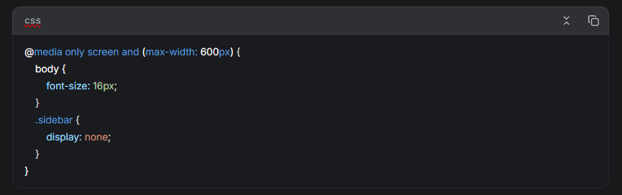
- Use CSS Media Queries: If coding your own design, use media queries to adjust layouts based on screen size. For example
- Leverage Plugins: Tools like WP Recipe Maker ensure recipe cards adapt to mobile screens, with features like “Jump to Recipe” buttons for quick navigation.
Pro Tip
Test your blog’s mobile-friendliness using Google’s Mobile-Friendly Test. Aim for a score of 100 to ensure optimal performance.
2. Use Short and Clear Headings
Headings organize your content and guide readers through your post, but on mobile devices, they must be concise to fit smaller screens. Clear, descriptive headings improve readability, encourage skimming, and enhance SEO by incorporating keywords.
Best Practices for Headings
- Keep It Short: Limit headings to 5-8 words to avoid truncation on mobile screens.
- Use Hierarchy: Employ H1 for the main title, H2 for major sections (e.g., “Ingredients,” “Instructions”), and H3 for subsections (e.g., “Tips for Success”).
- Incorporate Keywords: Include relevant terms like “vegan pizza recipe” to boost search visibility.
- Be Descriptive: Ensure headings reflect the content, e.g., “How to Make Chewy Cookies” instead of “Cookies.”
Example Heading Structure
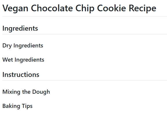
Chart: Heading Hierarchy
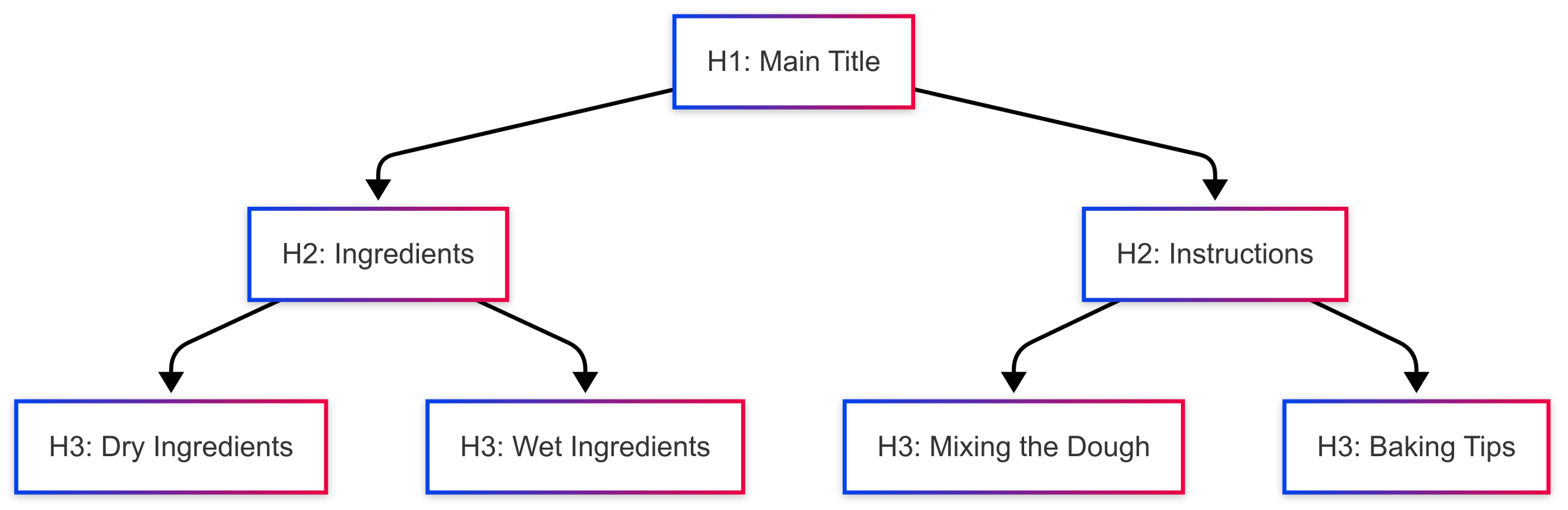
This structure ensures clarity and scannability, keeping mobile readers engaged.
3. Break Up Your Text
Long paragraphs overwhelm mobile readers, reducing engagement. Breaking text into smaller chunks with varied formatting makes your content digestible and visually appealing.
Techniques to Break Up Text
- Short Paragraphs: Limit paragraphs to 3-4 sentences or 150 words to prevent dense blocks.
- Bullet Points and Lists: Use numbered lists for recipe steps and bullets for ingredient lists to enhance scannability.
- Subheadings: Insert H2 or H3 tags every 200-300 words to guide readers.
- Visual Breaks: Add images, quotes, or callouts to vary the layout.
Example: Recipe Formatting
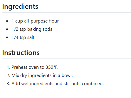
Impact on Engagement
Studies show that well-structured content with short paragraphs and lists increases time on page by up to 20%. This keeps readers engaged and reduces bounce rates.
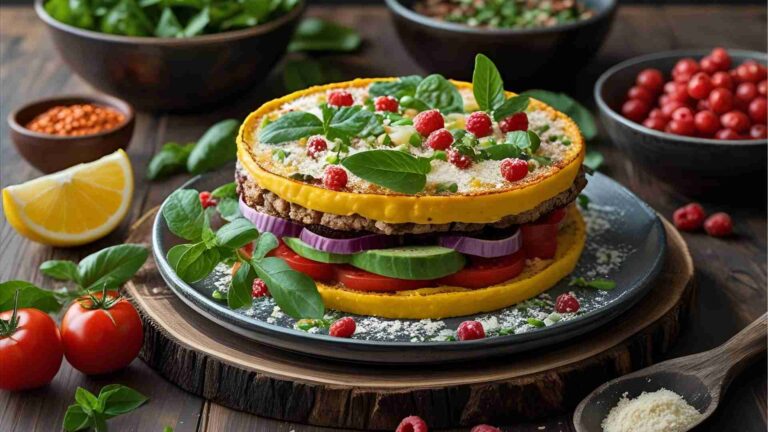
4. Optimize Your Images
Food photography is a food blog’s heart, but unoptimized images can slow down your site and frustrate mobile users. Proper image optimization balances quality and performance.
Image Optimization Strategies
- Choose the Right Format:
- JPEG: Ideal for photos with many colors (e.g., food shots).
- PNG: Best for graphics or images with transparency.
- WebP: Offers superior compression for faster loading without quality loss.
- Resize Images: Scale images to fit mobile screens (e.g., 800px wide) to avoid unnecessary data usage.
- Compress Files: Use tools like ShortPixel or TinyPNG to reduce file sizes to 200-500 KB.
- Add Alt Text: Include descriptive, keyword-rich alt text (e.g., “Vegan chocolate chip cookies on a cooling rack”) for SEO and accessibility.
Table: Image Optimization Tools
| Tool | Features | Price |
|---|---|---|
| ShortPixel | Compression, WebP conversion | Free (100 images/month), Paid ($4.99/month) |
| TinyPNG | Easy compression, bulk processing | Free (20 images/month), Paid ($25/year) |
| WP Recipe Maker | Auto-optimizes recipe card images | $49/year (Pro version) |
Pro Tip
Implement lazy loading to delay off-screen image loading, reducing initial page load time. Most WordPress themes and plugins like WP Rocket support this feature.
5. Increase Your Loading Speed
Mobile users expect pages to load in under 2 seconds. Slow sites increase bounce rates and hurt SEO rankings. Optimizing loading speed is critical for a mobile-friendly food blog.
Speed Optimization Techniques
- Reliable Hosting: Choose a host like SiteGround or WP Engine for fast server response times.
- Enable Caching: Use plugins like WP Rocket to store static versions of your pages.
- Minify Code: Remove unnecessary spaces and comments from HTML, CSS, and JavaScript using tools like Autoptimize.
- Use a CDN: A Content Delivery Network (e.g., Cloudflare) distributes content across global servers for faster delivery.
- Remove Unused Plugins: Deactivate plugins that add bloat without significant benefits.
Table: Speed Optimization Plugins
| Plugin | Features | Price |
|---|---|---|
| WP Rocket | Caching, minification, lazy loading | $59/year |
| Autoptimize | Code minification, image optimization | Free |
| Cloudflare | CDN, security, performance boosts | Free, Paid ($20/month) |
Chart: Speed Optimization Workflow
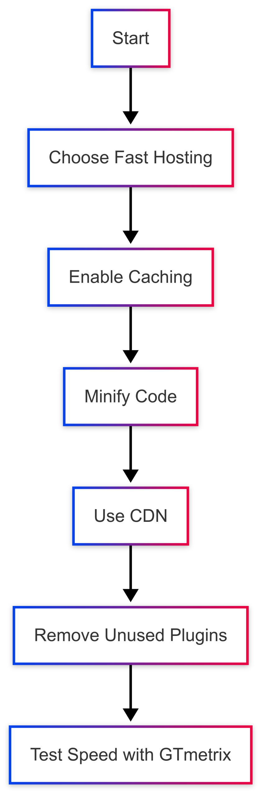
Impact
Pages loading in under 2 seconds can reduce bounce rates by up to 40%, per Kissmetrics, and improve Google rankings.
6. Enhance Your User Experience
A seamless user experience (UX) keeps mobile readers engaged and encourages interaction. Food blogs must prioritize navigation, readability, and interactivity on small screens.
UX Best Practices
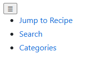
- Simplified Navigation: Use a sticky menu with a hamburger icon for easy access. Include a search bar and “Jump to Recipe” button.
- Readable Typography: Use a minimum font size of 16px and high-contrast colors (e.g., black text on white background).
- Interactive Elements: Add social sharing buttons, a comment section, and a printable recipe option.
- Cook Mode: WP Recipe Maker’s Cook Mode prevents screens from locking during cooking, enhancing usability.
- White Space: Ensure ample spacing between elements to avoid clutter.
Example: Mobile Navigation Menu
Pro Tip
Incorporate related recipe suggestions at the post’s end to encourage deeper browsing, increasing time on site.
7. Incorporate SEO Design Elements
SEO is critical for driving organic traffic to your food blog. Mobile-friendly design and structured data ensure your recipes rank higher and appear in rich snippets.
SEO Strategies
- Structured Data: Use WP Recipe Maker to add JSON-LD schema markup, including ingredients, cooking time, and ratings, for rich snippets.
- Keyword Optimization: Research long-tail keywords (e.g., “gluten-free pizza dough recipe”) using tools like Google Keyword Planner or AnswerThePublic.
- Alt Text: Add keyword-rich alt text to images (e.g., “Homemade vegan pizza with fresh basil”).
- Mobile-First Indexing: Ensure your mobile site mirrors desktop content, as Google prioritizes mobile versions for ranking.
- Internal Linking: Link to related recipes or category pages to improve dwell time and SEO.
Table: SEO Tools for Food Blogs
| Tool | Features | Price |
|---|---|---|
| Google Keyword Planner | Keyword research, search volume | Free |
| AnswerThePublic | Question-based keyword suggestions | Free, Paid ($99/month) |
| WP Recipe Maker | Schema markup, mobile optimization | $49/year (Pro version) |
Impact
Blogs using structured data see up to 30% higher click-through rates, per Google studies, making SEO a game-changer for visibility.
Additional Considerations
Monetization
A mobile-friendly food blog can be a revenue powerhouse. Optimize monetization with:
- Affiliate Links: Embed links to ingredients or tools within recipe cards using WP Recipe Maker.
- Ads: Place non-intrusive ads in natural breaks, ensuring they don’t disrupt UX.
- Email Sign-Ups: Use lead magnets like free recipe eBooks to build your audience.
Testing and Maintenance
Regularly test your blog on various devices and browsers. Use tools like GTmetrix for speed and Google Search Console to monitor SEO performance. Update content to reflect seasonal trends or algorithm changes.
WP Recipe Maker: The Ultimate Tool
WP Recipe Maker simplifies mobile-friendly food blogging with:
- Customizable Recipe Cards: Tailor layouts to match your brand.
- SEO Features: Auto-generates schema markup for rich snippets.
- Mobile Optimization: Ensures fast, responsive recipe displays.
- Monetization Tools: Integrates affiliate links and shoppable features.
- Price: $49/year for the Pro version, with a free version available.
Conclusion
Creating a mobile-friendly food blog post requires a blend of responsive design, optimized content, and user-focused features. By choosing a responsive theme, using clear headings, breaking up text, optimizing images, speeding up your site, enhancing UX, and leveraging SEO, you can craft posts that delight mobile readers and rank well on Google. Tools like WP Recipe Maker streamline the process, offering SEO, monetization, and mobile optimization in one package. Start implementing these strategies today to build a food blog that keeps readers hungry for more.
Please share this How to Create a Mobile-Friendly Food Blog Post with your friends and do a comment below about your feedback.
We will meet you on next article.
Until you can read, Find Your Food Blog Niche: Expert Tips for Success