How to Edit Food Photos in Lightroom (Step By Step)
Food photography demands precise editing to highlight textures, colors, and details that make dishes irresistible. Lightroom offers a streamlined workflow for this, emphasizing natural enhancements over artificial effects.
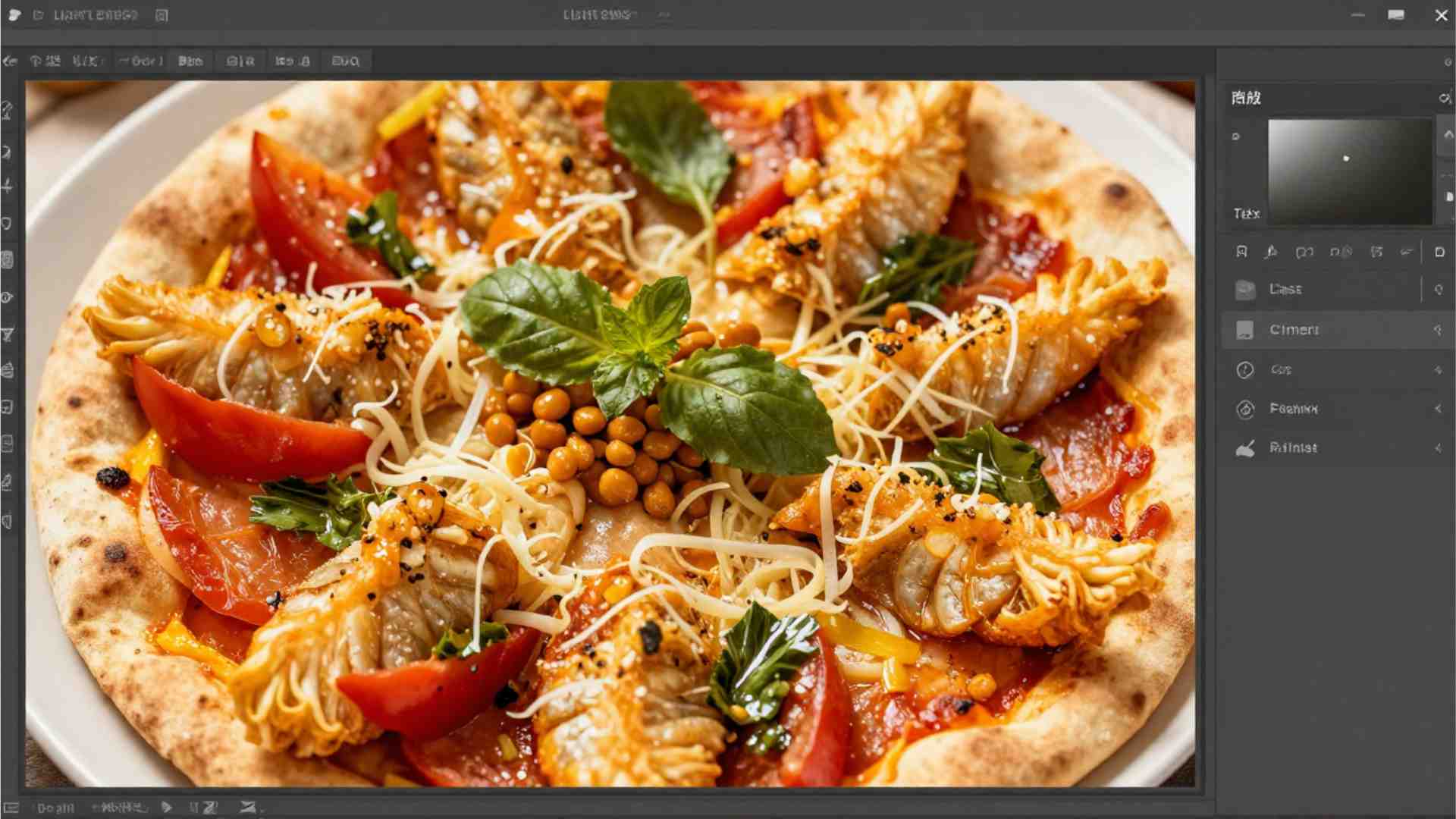
This guide walks through a comprehensive, step-by-step process using Adobe Lightroom Classic or Lightroom CC, adaptable to similar tools like Capture One or ON1 Photo RAW. We’ll use an example of an apple pie image straight from the camera—flat and lacking contrast—to demonstrate each adjustment. The goal: keep edits subtle, realistic, and focused on making the food look fresh and tactile.
By following this workflow, you’ll transform raw captures into professional-grade images. Expect to spend 10-20 minutes per photo once familiarized. Key principles include prioritizing texture for a sensory appeal, balancing colors to evoke freshness, and using targeted tools to avoid over-processing. Over-editing risks making food appear dry or unnatural, so monitor changes closely.
Understanding the Core Lightroom Workflow for Food Photography
Lightroom’s interface centers on the Develop module, where panels like Basic, Tone Curve, HSL/Color, and Detail handle most edits. Start by importing your photo (File > Import) and switching to Develop mode. For efficiency, create presets for repetitive adjustments, such as a “Food Base” preset saving white balance and lens corrections.
The workflow breaks into global adjustments (affecting the entire image) and local ones (targeted areas). Global steps build the foundation, while local refinements add polish. Here’s a high-level overview in a flowchart for visual clarity:
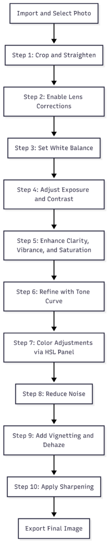
This flowchart illustrates the sequential nature of the process, ensuring foundational fixes precede creative tweaks. Now, let’s dive into each step with detailed instructions, rationales, and example applications.
Step 1: Crop and Straighten Your Food Photo
Cropping and straightening form the compositional base, ensuring the viewer’s focus lands squarely on the dish. Neglecting this can distract from the food’s appeal, as uneven horizons or extraneous elements pull attention away.
Activate the Crop tool by clicking its icon in the toolbar or pressing ‘R’. Lightroom overlays a grid for alignment. To straighten, hover outside the crop boundary and drag to rotate subtly until lines like table edges or horizons are level. Use the Auto button for quick AI-assisted straightening if the image has clear horizontals.
Next, evaluate composition. Food photos thrive on tight framing to emphasize textures—crop out empty space, distractions like stray crumbs, or unbalanced elements. For the apple pie example, the original had excess space on the left, diluting focus. Cropping inward by about 10% tightened the frame, centering the pie while retaining contextual elements like the table surface.
Proceed only after confirming the aspect ratio suits your output (e.g., 1:1 for Instagram, 16:9 for web banners). This step prevents revisiting later, maintaining workflow efficiency.
Step 2: Enable Lens Corrections
Lenses introduce distortions like barreling (outward bulging), pincushion (inward pinching), vignetting (edge darkening), and chromatic aberrations (color fringing). These flaws can make plates appear warped or colors unnatural, undermining food’s realism.
In the Lens Corrections panel (under Develop module), check “Enable Profile Corrections.” Lightroom auto-detects your lens model (e.g., Canon EF 50mm f/1.8) from metadata and applies a tailored profile. If undetected, select manually from the dropdowns.
Also, tick “Remove Chromatic Aberration” to eliminate purple/green fringes around high-contrast edges, common in shiny cutlery or glossy sauces. For the apple pie shot, enabling this corrected subtle vignetting from a wide-angle lens, brightening corners without manual tweaks.
If results overcorrect, adjust Distortion or Vignetting Amount sliders. Rarely, uncheck for creative effects, but for food, accuracy reigns. This step ensures a clean canvas, typically adding negligible processing time.
Step 3: Select the Right White Balance
White balance neutralizes color casts from lighting (e.g., warm tungsten or cool daylight), ensuring food colors appear true-to-life. Inaccurate balance can make reds muddy or greens sickly, reducing appeal.
If you set white balance in-camera or used a gray card, results may already be solid. Otherwise, use the Eyedropper tool in the Basic panel: click a neutral area (gray plate, white napkin) for auto-adjustment. Lightroom shifts Temp (blue-yellow axis) and Tint (green-magenta axis) accordingly.
For the apple pie, the original had a slight warm cast from indoor lights. Clicking a neutral table spot cooled it to 4800K Temp with +5 Tint, freshening the overall look. If no neutral reference, slide Temp manually—aim for 4500-5500K for most food, leaning cooler (below 5000K) for crispness or warmer (above 5500K) for coziness.
Creatively, subtle shifts enhance mood: cooler tones suggest freshness in salads, warmer in baked goods. But restrain to ±500K to avoid surrealism. Separate food from backgrounds via masks if needed for independent balancing.
After this, the pie’s crust gained definition, with reds popping naturally against a balanced backdrop.
Step 4: Adjust Exposure and Contrast
Tonal adjustments set the image’s brightness and depth, countering RAW files’ inherent flatness. Proper exposure reveals details in shadows and highlights, while contrast defines edges for a three-dimensional feel.
Start with the Exposure slider in the Basic panel: increase (+0.3 to +1.0) for underexposed shots to brighten without clipping highlights. For the pie, +0.5 EV lifted the overall scene, making the filling glisten.
Refine with Highlights (reduce to recover blown areas like glare on fruit), Shadows (boost to detail dark crusts), Whites (increase for pop in light tones), and Blacks (decrease for richer depths). In the example, Highlights -20 tamed shine on the lattice, Shadows +30 revealed texture in shadows, Whites +15 emphasized filling, and Blacks -10 added moodiness.
Finish with Contrast (+20-40) to separate tones. Alternatives include the Tone Curve for finer control (covered next). Monitor the histogram to avoid clipping—peaks should hug but not exceed edges.
This step transforms dull captures into vibrant ones, with the pie now exhibiting balanced tones that invite closer inspection.
Step 5: Adjust Clarity, Vibrance, and Saturation
These sliders enhance midtone contrast and color intensity, crucial for food’s tactile allure. Clarity boosts edge definition in textures like flaky pastry or saucy drips, but excess creates harshness.
Set Clarity +10-50; for the pie, +42 accentuated crumbs without drying the appearance. Vibrance intelligently saturates undersaturated colors (+10-30), adding life subtly. Saturation affects all colors globally (+0-10 max to avoid garishness); here, -5 toned down background blues, focusing on warm pie tones.
Experiment iteratively: boost Clarity first, then Vibrance to compensate for any desaturation, and touch Saturation last. Common pitfall: over-Clarity (+60+) makes food look processed. For reference, here’s a table of typical ranges:
| Slider | Typical Range for Food | Purpose | Example Effect on Pie |
|---|---|---|---|
| Clarity | +10 to +50 | Enhance midtone texture | Crisper crust edges |
| Vibrance | +10 to +30 | Subtle color boost | Warmer filling hues |
| Saturation | -10 to +10 | Global color intensity | Muted background |
This ensures natural vibrancy, making the pie look oven-fresh.
Step 6: Work with the Tone Curve
The Tone Curve provides nuanced tonal control beyond sliders, mapping shadows (left), midtones (center), and highlights (right) on a graph. It’s ideal for custom contrast curves, like an S-shape for punchy food images.
Click to add points: lift midtones for brightness, drop shadows for depth, pull highlights down for subtlety. For the pie, a mild S-curve (shadows -10, midtones +15, highlights -5) added contrast, darkening the table while brightening the pie.
Region sliders (Highlights, Lights, Darks, Shadows) offer slider-based tweaks for beginners. Use RGB mode for overall, or channel-specific for color grading (e.g., boost red curve for warmer food).
This tool’s power lies in precision—avoid extreme bends to prevent banding. The pie gained a film-like depth, with textures standing out more vividly.
Step 7: Perform Color Adjustments with the HSL Panel
HSL (Hue, Saturation, Luminance) targets specific colors for fine-tuning, essential for realistic food rendition. Greens often need hue shifts to avoid yellowness, reds saturation for vibrancy.
In Hue: slide Green -10 to +10 for freshness; for the pie, Blue -15 shifted toward teal, neutralizing magenta. Saturation: boost Red/Orange +10-20 for warm dishes, desaturate distracting colors. Luminance: brighten Yellow +15 for golden crusts.
Process: Hue first for base color, Luminance for brightness, Saturation last. The pie’s blues lightened and desaturated, letting warm tones dominate.
HSL prevents global overcorrections, preserving mood.
Step 8: Reduce Noise
Noise from high ISO or underexposure appears as grain, detracting from smooth textures. In the Detail panel, increase Luminance (10-30) for brightness noise, Color (10-20) for chromatic specks.
For the low-ISO pie, Luminance +20 sufficed, retaining detail. Zoom to 100% and use Masking to protect edges. Over-reduction softens unpleasantly.
Step 9: Apply Post-Crop Vignetting and Dehaze
Vignetting darkens edges to guide eyes inward; Dehaze cuts haze for clarity. In Effects, set Vignette Amount -10 to -30, Midpoint 50, Feather 70 for softness. The pie’s vignette (-20) moodied the frame.
Dehaze +5-15 sharpens foggy scenes, but sparingly for food.
Step 10: Sharpen the Image
Sharpening enhances edges without fixing blur. In Detail, set Amount 40-80, Radius 1.0, Detail 25. Masking (hold Alt) targets food: +60-80 whites out non-edges.
For the pie, Amount +50 with Masking +75 crisped the lattice, ignoring the background.
Tips for Optimal Results
- Maintain naturalism: Compare to unedited references.
- Emphasize texture: Use Clarity and Sharpening judiciously.
- Reference pros: Study edits from sources like Food & Wine.
- Key tools: HSL for colors, Masks for locals (e.g., radial on dish center).
- Local adjustments: Brushes dodge glare, gradients balance lighting.
Final Comparison and Export
Before/after: The edited pie shows refined contrast, vibrant colors, and sharp textures versus the flat original.
Export via File > Export: JPEG for web (Quality 80), sRGB color space.
Implement these steps to elevate your food photos—focus on what makes the dish crave-worthy. Share workflow tweaks in comments.
Please share this How to Edit Food Photos in Lightroom (Step By Step) with your friends and do a comment below about your feedback.
We will meet you on next article.
Until you can read, Looking for a recommendation on Food Photography Books