Lightroom Mistakes You Are Probably Making
Lightroom is a powerful tool for organizing, editing, and exporting photos, but small errors in processing, workflow, and file management can ruin images, waste time, and create unnatural results.
Beginners and experienced users alike often overuse sliders like Clarity and Texture, crank saturation, skip histogram checks, or neglect organization, leading to clipped details, garish colors, crooked compositions, and hard-to-find files.
This guide covers the most frequent pitfalls—drawn from editing fundamentals, user reports, and practical experience—and provides step-by-step fixes to achieve cleaner, more professional results. Focus on these to build consistency, preserve dynamic range, and speed up your process without over-processing.
Overusing Clarity, Texture, and Sharpening
Excessive Clarity or Texture creates a “crunchy,” HDR-like appearance with ugly halos around edges and unnatural midtone contrast. Texture amplifies this on portraits, emphasizing skin pores or fabric weave in unrealistic ways. Over-sharpening adds edge halos, banding, and noise artifacts, making images look alien or processed.
Why it ruins photos: These tools apply localized contrast. At high values (Clarity >20-30, Texture >15-20, Sharpening Amount >50-75 without masking), they exaggerate edges beyond natural optics, especially in high-ISO or JPEG files. Halos appear as light/dark outlines along high-contrast boundaries like horizons or hair.
How to spot it: Zoom to 100% view. Look for white/black lines along edges or crosshatching in skies. Compare before/after.
Fixes:
- Limit Clarity to +5-15 for landscapes or +0-10 for portraits.
- Use Texture sparingly (+5 max on skin).
- For sharpening: Set Amount 40-80, Radius 0.8-1.2, Detail 25-50, Masking 20-60 (hold Alt/Option while dragging Masking to preview edges).
- Apply sharpening at 100% zoom after noise reduction.
- Use local tools (Adjustment Brush or Graduated Filter) instead of global sliders for targeted clarity.
Avoid combining high Clarity + high Sharpening, as they compound edge contrast. Start low and build.
Excessive Saturation and Color Issues
Cranking Saturation produces garish, unrealistic colors, especially muddy skin tones or neon greens/blues. Overusing the Temperature slider warms the entire image unnaturally. Subtle casts—like blue hair from sky reflections, red ears/hairline from lighting, or orange skin highlights—go unnoticed but throw off the aesthetic.
Why it fails: Global Saturation affects all hues equally, clipping channels and losing subtlety. Temperature shifts the whole white balance, while casts arise from mixed lighting or reflections.
Fixes:
- Use Vibrance (+10-30) for selective saturation on less-saturated areas; keep Saturation at 0-10.
- For warmth: Use Color Grading (Highlights tab) to add yellow/orange selectively. Or brush warmth (+10-20 Temperature) on subjects only.
- Mask skin (Select Subject or Luminance/Range Mask) and desaturate oranges/reds (-10 to -30) or cool blue casts.
- HSL panel: Reduce specific hue saturation/luminance (e.g., Orange Hue -10, Saturation -15 for skin).
- Identify casts by toggling before/after or sampling with the eyedropper.
For odd casts: Scan at 100% or use the Target Adjustment Tool (TAT) on problem areas in HSL.
Ignoring the Histogram and Clipping
Skipping the histogram leads to clipped highlights (blown skies/details lost) or shadows (muddy blacks, no detail). Heavy-handed contrast/darkening crushes midtones, creating heavy, low-dynamic-range images.
Why it’s critical: The histogram shows tonal distribution. Clipped areas (pure white >255 or black <0) lose recoverable detail, especially in RAW (more latitude than JPEG).
Best practices:
- Keep histogram visible in Develop module.
- Enable clipping indicators (J key or triangles in histogram corners): Red for highlights, blue for shadows.
- Aim for data spanning the range without major piles at ends, except intentional pure white/black points.
- Fix: Lower Highlights/Whites to recover bright areas; lift Shadows/Blacks for darks. Adjust Exposure first if needed.
Histogram best use:
- Judge visually in preview alongside histogram—don’t chase “perfect” distribution at expense of mood.
- For dark scenes: Accept some shadow clipping if artistic; recover highlights aggressively.
Crooked Horizons and Composition Basics
A tilted horizon immediately signals sloppy editing. It disrupts balance even if the original shot was level.
Fix: Use Crop tool (R key), enable grid or straighten overlay. Drag edge or use Auto for lens corrections. Enable Lens Corrections (Upright or Profile) early for perspective fixes.
Apply after basic tones but before creative adjustments.
Improper White Balance and Vignettes
Wrong WB creates unnatural color casts, ruining mood (e.g., tungsten indoors looking blue). Heavy vignettes (especially dark or obvious) distract from the subject.
Fixes:
- Set WB with eyedropper on neutral gray/white, or use As Shot and fine-tune Temperature/Tint.
- For creative warmth: Selective via Color Grading or brushes.
- Vignette: Post-crop, Amount -10 to -30, Midpoint 20-50, Feather high for subtlety. Use light vignette sparingly or none.
Avoid global dark vignettes; use local dodging/burning instead.
Editing Order and Foundational Adjustments
Jumping to contrast/pop without foundation darkens images unnecessarily. Over-relying on contrast/boosting blacks weighs down the photo.
Recommended order (foundational first):
- Crop/straighten + lens corrections.
- White balance.
- Exposure, Highlights, Shadows, Whites, Blacks (tone curve if needed).
- Contrast (moderate, +10-30).
- Clarity/Texture sparingly.
- Color (HSL, Vibrance).
- Local adjustments.
- Sharpening/Noise Reduction.
- Vignette/Dodge & Burn.
This preserves dynamic range and avoids heavy darkness.
chart for editing workflow:
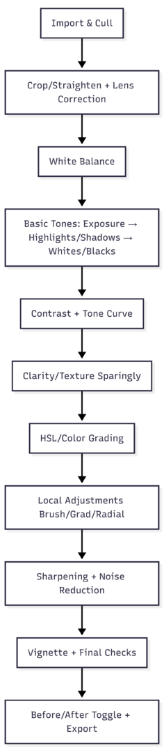
Toggle with Backslash () frequently to compare original vs. edited—ensures improvements, not over-processing.
Lack of Consistency and Personal Style
Starting fresh every edit creates disjointed portfolios. No recognizable style makes work forgettable.
Build consistency:
- Develop a repeatable process (use the workflow above as template).
- Create custom presets for starting points (not full looks)—e.g., base tone curve or WB starting points.
- Use virtual copies for variations.
- Reference a “hero” image side-by-side for style matching.
Experiment with tone curves (S-curve for pop without global contrast) but avoid presets as sole reliance—learn sliders first.
Local Adjustments Over Global
Global sliders ruin the whole image. Over-editing affects unintended areas.
Better: Use Adjustment Brush, Graduated/Radial Filters, or masks for selective Clarity, exposure, color. Invert masks when needed. Range masks or AI Select Subject help target skin/sky precisely.
Not Using Keyboard Shortcuts
Mouse-only editing slows workflow dramatically. Copy/paste settings (Cmd/Ctrl + C/V), sync across photos, or quick keys like J (clipping), R (crop), W (WB eyedropper), \ (before/after) are essential.
Key shortcuts:
- \ : Toggle before/after
- Q : Spot removal
- K : Adjustment brush
- M : Graduated filter
- ]/[ : Brush size
- Alt/Option drag sliders: Preview effect
Learn 10-15 core ones first; efficiency gains compound.
Poor Organization, Import, and File Management
Default folders make photos hard to find. Wrong import (Move vs. Copy/Add) risks data loss. Renaming/moving files outside Lightroom breaks links (exclamation marks appear).
Best practices:
- Import: Always Copy to new location or Add (if already organized). Avoid Move.
- Folders: Date-based (YYYY/MM/DD-Event) or project-based.
- Keyword every image: Who, what, where, colors, concepts (e.g., “portrait, beach, sunset, blue hour”). Use keyword lists/suggestions.
- Cull ruthlessly: Flag keepers (P), reject (X), delete from disk after review.
- Collections: Smart collections for virtual grouping; use flags, stars, color labels.
- Never rename/move outside Lightroom—do it inside (right-click > Rename, or Folders panel).
- Shoot RAW for maximum flexibility (non-destructive edits, more recovery latitude). JPEGs bake in settings permanently.
Table of Common Mistakes and Fixes:
| Mistake | Common Symptom | Primary Fix | Prevention Tip |
|---|---|---|---|
| Over Clarity/Texture | Halos, crunchy look | Limit to +5-15; use locally | Preview at 100%; mask edges |
| Excessive Saturation | Garish colors, bad skin | Use Vibrance; HSL selective | Sample skin tones |
| Ignore Histogram/Clipping | Lost details, blown highlights | Enable indicators; recover Highlights | Expose for highlights in-camera |
| Crooked Horizons | Tilted composition | Crop tool + grid | Enable overlays |
| Wrong Import | File loss/duplicates | Copy/Add only | Backup cards before import |
| No Keywords | Unsearchable catalog | Add keywords during import/cull | Build keyword hierarchy |
| Over-sharpening | Halos, noise | Masking slider; 100% view | Sharpen last |
| Heavy Contrast/Vignette | Dark, heavy image | Foundational tones first; subtle vignette | Use dodging/burning |
Pro Tips for Better Results
- Step away: Edit, then review hours/days later—fresh eyes catch over-processing.
- Adjust tones first: Always balance exposure/highlights/shadows before color or “pop.”
- Use Backslash liberally.
- Virtual copies for experiments (no extra storage).
- Learn tone curve for precise control (S-curve adds midtone contrast safely).
- Print or view on calibrated monitors—screens can lie about colors.
Avoid preset-only workflows; they rarely fit every photo. Instagram validation or heavy compression can mislead—focus on full-res previews.
Lightroom edits remain non-destructive: Reset anytime, create virtual copies, or start over. Experimentation is safe.
By addressing these mistakes—over-processing, poor checks, inefficient habits, and disorganization—you’ll produce more natural, consistent images faster. Train your eye on histograms, subtle colors, and before/after views. Practice the foundational order, use tools selectively, and build systems for organization. The result: stronger portfolio, less frustration, and recognizable style.
Please share this Lightroom Mistakes You Are Probably Making with your friends and do a comment below about your feedback.
We will meet you on next article.
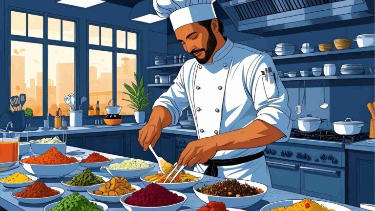
Until you can read, Photographing Food Head-On