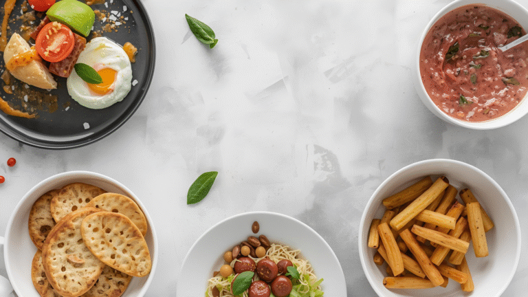
The Most Common Food Photography Mistakes
Great food photography is less about expensive gear and more about avoiding the errors that silently sabotage your shots. Whether you’re shooting on a smartphone or a professional Dmirrorless system, the same fundamental mistakes appear over and over — and most are surprisingly easy to fix once you know what to look for.
This guide covers every major pitfall in food photography, from lighting and focus to editing and composition, with practical solutions you can apply immediately.
1. Using On-Camera Flash (The #1 Lighting Mistake)
Nothing destroys a food photo faster than on-camera flash. It flattens texture, washes out color, creates harsh shadows directly behind the subject, and produces that telltale “amateur snapshot” look — regardless of how expensive your camera is.
The reason is simple: on-camera flash sits directly beside the lens, which means the light travels from exactly the same direction as the camera. Front-on, direct light eliminates depth. The contrast between light and shadow — which is what makes food look three-dimensional and appetizing — disappears entirely.
The fix: Use natural window light instead. Find a window without direct sunlight, turn off all artificial lights in the room, and position your food so the light hits it from the side or slightly behind. This single change will transform your images more than any camera upgrade.
Optimal Lighting Setups for Food Photography
| Light Direction | Effect on Food | Best Use Case |
|---|---|---|
| Side lighting (90°) | Highlights texture, creates depth | Bread, pastries, textured surfaces |
| Back lighting (45° behind) | Creates rim light, glowing effect | Soups, drinks, translucent foods |
| Front lighting (0°) | Flat, no depth | Avoid for food photography |
| Top-down diffused | Even, clean look | Flat-lay compositions |
| Reflected fill light | Reduces harsh shadows | Balancing backlit scenes |
If natural light isn’t available, invest in a continuous LED panel with a large softbox. A basic setup (panel + diffuser + reflector) runs $80–$250 and replicates window light reliably.
2. Shooting in JPEG Instead of RAW
JPEG files are processed in-camera — they’re already compressed, color-corrected, and sharpened according to the camera manufacturer’s defaults, not your creative vision. When you try to edit them in post, you’re working with limited data.
RAW files capture everything the sensor sees. They look flat and dull straight out of camera, but that’s intentional — all the dynamic range is preserved and waiting for you to shape it in Lightroom, Capture One, or similar software.
JPEG vs. RAW: Key Differences
| Feature | JPEG | RAW |
|---|---|---|
| File size | Small (4–8 MB) | Large (20–40 MB) |
| Edit flexibility | Limited | Extensive |
| Highlight recovery | Poor | Excellent |
| Color correction | Baked in | Fully adjustable |
| Workflow speed | Fast | Requires editing step |
| Best for | Social media snaps | Professional work |
For food photography specifically, RAW makes the most difference when recovering blown-out highlights on shiny surfaces (glazed donuts, wet salads, lacquered meats) and correcting white balance under mixed or artificial lighting.
3. Ignoring White Balance
Every light source has a color temperature measured in Kelvin. Your eyes compensate automatically — a piece of white paper looks white whether you’re indoors or outside. Your camera does not make this adjustment unless you tell it to.
Shoot under tungsten bulbs without correcting white balance and your food turns orange. Use a cool LED panel uncorrected and your dish goes blue-grey. Both make food look unappetizing and unnatural.
Color Temperature Reference Chart
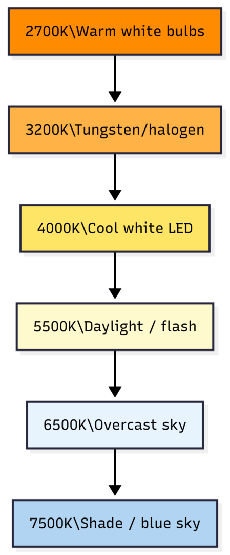
The fix: Set a custom white balance using a grey card, or shoot RAW and adjust in post. For most natural window light setups, a daylight preset (5500K) is a solid starting point. Slightly warm images (leaning toward 5000–5500K) tend to make food look more inviting than perfectly neutral ones.
4. Camera Shake and Blurry Images
Blurry images where nothing is in sharp focus are almost always caused by camera shake — the camera moving during the exposure. This is distinct from focus blur, where part of the image is sharp and part isn’t.
Camera shake happens when shooting handheld at shutter speeds too slow to freeze camera movement, or when physically pressing the shutter button on a tripod-mounted camera causes vibration.
The rule: Your handheld shutter speed should be at least 1/(focal length). Using a 50mm lens? Keep shutter speed at 1/50s or faster. Using a 100mm macro? At least 1/100s.
The solutions:
- Use a tripod — non-negotiable for serious food photography
- Use a remote shutter release or your camera’s 2-second timer
- Increase ISO to allow faster shutter speeds in low light
- Widen your aperture (lower f-number) to bring in more light
Modern cameras handle ISO 1600–3200 cleanly. A little noise is invisible at viewing size; blur is not.
5. Wrong or Missed Focus Point
Missing focus is one of the most frustrating mistakes because it often isn’t obvious until you zoom in on the image. Part of the photo looks sharp, but it’s the plate rim, the background garnish, or the table surface — not the hero element of the dish.
This happens because autofocus systems guess at what to focus on, and their guess is often wrong. The camera focuses on whatever is closest, most contrasty, or closest to the center — which may not be your intended subject.
The fix: Switch to single-point autofocus and manually select the focus point using your camera’s directional pad or touchscreen. In Live View, zoom in digitally to 5x or 10x and confirm critical sharpness before shooting.
For shallow depth-of-field shots (f/1.8–f/2.8), even a 2cm shift in camera position after setting focus can throw the subject out of focus entirely. Lock focus, then don’t move.
Focus Strategy by Aperture
| Aperture | Depth of Field | Focus Precision Required | Recommended Method |
|---|---|---|---|
| f/1.4–f/2 | Very shallow | Extreme | Manual focus + Live View zoom |
| f/2.8–f/4 | Shallow | High | Single-point AF, check LCD |
| f/5.6–f/8 | Medium | Moderate | Single-point AF |
| f/11–f/16 | Deep | Low | Any method |
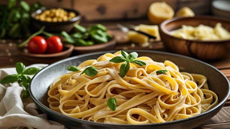
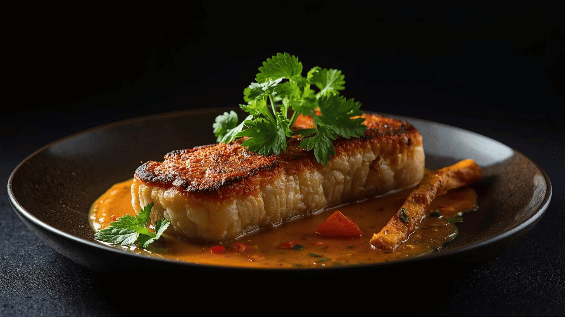
6. Poor Composition
Composition is how you arrange every element in the frame — the food, props, background, negative space, and the relationship between all of them. Bad composition makes even beautifully prepared food look boring or cluttered.
The Core Composition Rules
Rule of Thirds: Divide the frame into a 3×3 grid. Place your hero element at one of the four intersection points, not dead center. This creates visual tension and interest.
Odd Numbers: Three cookies, five strawberries, seven crackers. Odd groupings feel more natural and dynamic than even ones.
Negative Space: Empty areas in the frame give the subject visual breathing room and create a clean, modern look. Resist the urge to fill every corner.
Leading Lines: Use utensils, napkins, table edges, or drizzle trails to draw the viewer’s eye toward the main dish.
Layers and Depth: Include foreground elements (a sprinkle of herbs, a partially cut ingredient), a clearly defined subject, and a soft background. This creates the three-dimensional depth that flat food photos lack.
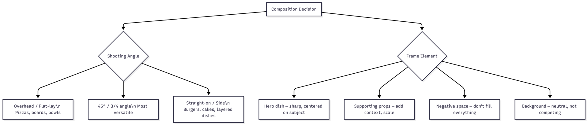
Choosing the right angle is as important as lighting. Flat-lay works for pizzas, grazing boards, and bowls. Straight-on angles suit burgers, layer cakes, and stacked sandwiches. The 45° angle is the most forgiving all-rounder.
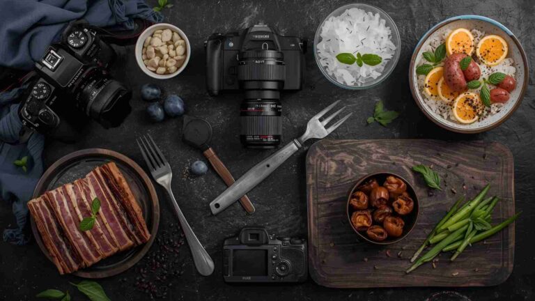
7. Cluttered or Unstylished Scenes
Poor food styling is immediately visible — but invisible good food styling is the goal. A messy scene with random props, sauce smears on the plate edge, wilted herbs, or a distracting background competes with the food for attention.
Common scene mistakes:
- Too many props with no visual hierarchy
- Props that don’t relate to the food (a coffee mug beside a steak)
- Dirty plate edges and drips (wipe them before shooting)
- Overly busy backgrounds that steal attention
- No props at all, leaving the dish looking lonely and contextless
The fix: Style with intention. Choose 2–3 complementary props maximum. Use fabrics and textures (linen napkins, wooden boards, slate) to add depth without visual noise. Clean plate edges with a paper towel dampened with water. Add garnishes and fresh herbs only immediately before shooting — they wilt fast.
For scale reference, smaller plates make food look more abundant. A large plate with a small portion looks sparse; a smaller plate with the same portion looks generous.
8. Over-Editing
Heavy-handed post-processing is one of the most common mistakes, and it’s also one of the hardest to self-diagnose — because after staring at an image for an hour while editing, your eye adapts and what’s extreme starts to look normal.
Signs Your Editing Is Too Heavy
| Symptom | Cause | Fix |
|---|---|---|
| Colors look neon or impossible | Oversaturation | Drop vibrance and saturation |
| Edges have white halos | Excessive sharpening or clarity | Pull back sharpening, use masking |
| Food looks plastic | Over-smoothed skin tones or texture removal | Use texture and clarity, not noise reduction |
| Sky / background looks fake | Over-processed HDR effect | Reduce highlights and shadows |
| Obvious dark vignette | Too aggressive vignetting | Use feathered, subtle values only |
The rule of thumb: if you can see the editing, the editing is bad. Good editing is invisible — it enhances the shot to match what your eye saw in the moment, without announcing itself.
The process: Edit in stages. Start with exposure and white balance corrections, then move to color grading, then sharpening. Take a 10-minute break before final review — fresh eyes catch over-editing that tired eyes miss. Compare periodically to the unedited original.
9. Using the Wrong Lens
Lens choice affects perspective distortion, working distance, depth of field, and whether the food actually looks appetizing. Wide-angle lenses (under 35mm) distort food at close range, making it look warped and unnatural. Long lenses (85mm+) compress perspective and require more distance, but often produce more flattering results.
Lens Recommendations for Food Photography
| Focal Length | Best For | Typical Price Range |
|---|---|---|
| 24–35mm | Environmental wide shots, context | $200–$600 |
| 50mm | Versatile, natural perspective | $100–$500 |
| 85–100mm | Flattering portraits of dishes, macro-adjacent | $400–$1,200 |
| 100mm Macro | Extreme close-up detail shots | $500–$1,500 |
The 50mm lens is the most common starting recommendation for food photography — it renders perspective close to how the human eye sees, avoids the distortion of wide angles, and maintains a reasonable working distance. If budget allows, a 100mm macro opens up close-up detail shots that are simply not possible with shorter lenses.
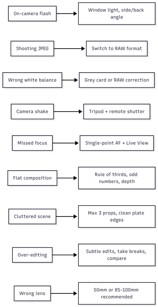
Quick Reference: Mistake vs. Fix Summary
The Learning Progression
Most beginners make all of these mistakes simultaneously, which can feel overwhelming. The most effective approach is to fix one variable at a time. Start with lighting — it delivers the biggest visible improvement per unit of effort. Then tackle composition, then technical camera settings, then editing workflow.
Photography improves through repetition and deliberate review. After every shoot, identify the one thing that most limited the quality of your images and focus your next session on fixing that single issue. Progress is faster and more durable than trying to overhaul everything at once.
The mistakes covered here are universal. Every professional food photographer made them early in their career. The difference between a beginner and an expert isn’t talent — it’s accumulated, deliberate practice paired with honest self-critique.
Please share this The Most Common Food Photography Mistakes with your friends and do a comment below about your feedback.
We will meet you on next article.
Until you can read, Why You Should Shoot Tethered for Food Photography