How to Use the HSL/Color Panel in Adobe Lightroom
Adobe Lightroom’s HSL/Color panel is a powerhouse for color editing, allowing photographers to fine-tune specific colors without affecting the entire image. Found in the Develop module, this tool targets eight color ranges—red, orange, yellow, green, aqua, blue, purple, and magenta—providing control over hue (the actual color), saturation (intensity), and luminance (brightness).
Whether you’re correcting color casts, enhancing moods, or simplifying palettes, mastering this panel elevates your edits from basic to professional. This guide covers everything from basics to advanced techniques, helping you achieve targeted color grading efficiently.
Understanding the HSL/Color Panel Basics
The HSL panel, often called the Color Mixer in newer Lightroom versions, enables independent adjustments to hue, saturation, and luminance for each of the eight colors. This selectivity is what sets it apart from global tools like the Basic panel’s temperature or vibrance sliders, which impact the whole photo.
- Hue: Shifts the color itself. For example, moving the green hue slider left makes greens more yellow, while right shifts them toward aqua.
- Saturation: Controls color vividness. Increase for bolder tones; decrease for muted or grayscale effects.
- Luminance: Adjusts brightness. Boost to lighten a color; reduce to darken it, adding depth or contrast.
These adjustments cover the full color spectrum, making the panel versatile for any image. In the HSL view, sliders are grouped by function (all hues together, then saturations, then luminances). The Color view organizes by individual color, showing hue, saturation, and luminance sliders for one color at a time. Switch between views by clicking “HSL” or “Color” in the panel header. The HSL view includes a unique target tool for direct image-based edits.
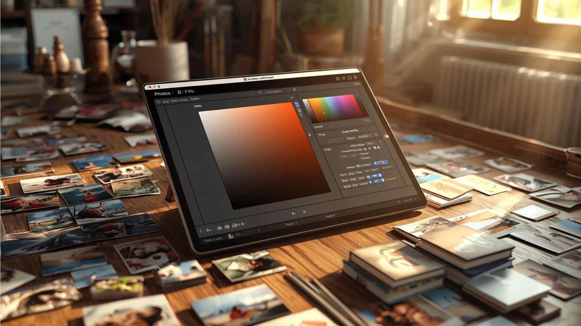
To access it, open Lightroom, import a photo, switch to the Develop module, and scroll to the HSL/Color panel on the right sidebar. Expand it to reveal the sliders. For a comprehensive overview, click “All” in the HSL view to see every slider simultaneously.
Here’s a table summarizing the eight colors and their typical applications:
| Color | Common Elements Affected | Hue Shift Examples | Saturation Uses | Luminance Uses |
|---|---|---|---|---|
| Red | Skin tones, flowers, sunsets | Toward orange (warmer) or magenta (cooler) | Boost for vibrant roses; reduce for neutral skin | Brighten for pop; darken for depth |
| Orange | Sunsets, autumn leaves, skin | Toward red or yellow | Enhance warmth; desaturate distractions | Lighten highlights; darken shadows |
| Yellow | Sunlight, fields, highlights | Toward orange or green | Vivid for golden hours; mute for subtlety | Brighten for glow; darken for contrast |
| Green | Grass, foliage, trees | Toward yellow or aqua | Reduce neon greens; boost natural vibrancy | Darken backgrounds; lighten subjects |
| Aqua | Oceans, skies, water | Toward green or blue | Enhance tropical waters; desaturate casts | Adjust for moody or bright effects |
| Blue | Skies, water, denim | Toward aqua or purple | Deepen skies; fix bland blues | Darken for dramatic clouds; lighten for airiness |
| Purple | Flowers, sunsets, fabrics | Toward blue or magenta | Boost creative palettes; reduce unwanted tints | Add contrast in low-light scenes |
| Magenta | Flowers, skies at dusk | Toward purple or red | Eliminate casts in whites; enhance pinks | Brighten for highlights; darken for mood |
This table serves as a quick reference during editing, ensuring you target the right sliders.
Step-by-Step Guide to Accessing and Navigating the Panel
Start by importing your RAW or JPEG files into Lightroom. In the Develop module, ensure you’ve applied basic edits first—exposure, contrast, whites, blacks, temperature, and tint. These global changes provide a solid foundation, as HSL/Color is best for refinements.
Once ready, locate the HSL/Color panel. If it’s in HSL mode, you’ll see sections for Hue, Saturation, and Luminance, each with eight sliders. Slide left for negative values (e.g., less saturation) or right for positive. For precision, double-click a slider to reset it or enter numerical values.
In Color mode, select a color from the list (e.g., Blue), and adjust its hue, saturation, and luminance individually. This mode is ideal for focused work on one color without distractions.
For black-and-white conversions, the panel transforms into the B&W panel when you toggle Treatment to Black & White in the Basic panel. Here, the same eight sliders control grayscale tones, mimicking traditional film filters. Lighten reds for smoother skin or darken blues for dramatic skies.
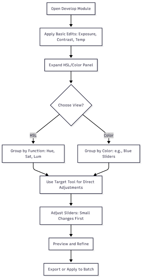
This flowchart outlines the workflow, emphasizing a logical progression to avoid over-editing.
Mastering Hue Adjustments
Hue adjustments alter a color’s identity without changing its intensity or brightness. Each slider corresponds to a color wheel segment, allowing shifts within adjacent hues.
For accurate representation, use hue to match what you saw in real life. If a sunset’s oranges appear too red in your RAW file, slide orange left toward red for correction. Artistically, hue creates moods—shift blues toward aqua for calm oceans or greens toward yellow for vibrant foliage.
In color theory, hue helps harmonize palettes. Complementary colors (opposites on the wheel, like blue and orange) create contrast; analogous (adjacent, like green and yellow) offer harmony. To apply, identify dominant colors in your image via the eyedropper tool, then adjust hues to align with your vision.
Example: In a forest scene with yellowish leaves, shift yellow hue right toward green for a fresher look. Avoid extremes to prevent unnatural results—aim for shifts under ±30 for subtlety.
Hue is non-destructive, so experiment freely. If skin tones (often orange-red mixes) turn unnatural, counter with slight opposite shifts.
Saturation Adjustments for Vibrancy Control
Saturation governs color strength, from grayscale (0) to maximum vividness (100). It’s straightforward but powerful for directing viewer attention.
Use it realistically to counter RAW file flatness—boost blues for skies or greens for landscapes. Artistically, desaturate distractions: In a portrait, reduce background yellows to emphasize the subject’s reds.
For palettes, saturation simplifies images. Desaturate non-essential colors for a duotone effect, like keeping blues vibrant while muting others for a cool mood. Watch for clipping—extreme desaturation can cause pixelation; zoom in to check transitions.
Example: In an indoor shot with orange casts from lights, reduce orange saturation by -20 to -50. If reds clip (common in flowers), lower red saturation accordingly.
Combine with global vibrance (which protects skin tones) for balanced results. Saturation adjustments add no noise if kept moderate.
Luminance Adjustments for Depth and Contrast
Luminance controls color brightness, independent of hue and saturation. It’s excellent for contrast without masks.
Boost luminance to highlight subjects—lighten yellows in sunlight for glow. Reduce to deepen shadows—darken greens in backgrounds for recession.
For distractions, lower luminance on offending colors. In landscapes, darken blues for moody skies or greens for focused foregrounds.
Example: In a tree photo, boost green and yellow luminance by +15 to +30 to make leaves pop against darker elements. This creates natural separation.
Luminance affects perceived contrast; pair with the Contrast slider for amplified effects. Avoid over-brightening, which can clip highlights—use the histogram for monitoring.
The Targeted Adjustment Tool: Intuitive Editing
The target tool, exclusive to HSL view, simplifies adjustments. Click the circle icon next to Hue, Saturation, or Luminance. Your cursor becomes a target—click a color in the image and drag up (increase) or down (decrease). Lightroom auto-adjusts relevant sliders, even blends like yellow-green.
This is ideal for mixed colors: Target a sky (blue-aqua mix) to deepen without guessing sliders. It’s faster than manual tweaks and reduces trial-and-error.
Example: In a sunset, target oranges in clouds—drag up for saturation boost, creating warmth without affecting reds.
Practice on varied images to master it. Note: It affects all instances of that color globally, so check for unintended changes (e.g., blue sky adjustments impacting clothing).
Differences Between HSL and Color Views
HSL view suits overview edits, showing all sliders by function. It’s great for comparing adjustments across colors.
Color view focuses on one color, reducing clutter—perfect for detailed work. It lacks the target tool, so switch to HSL for that.
Choose based on workflow: HSL for broad tweaks, Color for precision.
In newer versions, “Color Mixer” renames it, adding a “Color” view option for slider organization.
Using HSL/Color for Mood and Creative Grading
Color grading follows basic edits, using HSL to evoke emotions.
- Warmth: Boost orange/yellow saturation and luminance for inviting scenes.
- Cool Calm: Shift blues to aqua, lower luminance for moody effects.
- Fix Casts: Desaturate magentas in whites for neutrality.
Simplify by reducing competing colors—desaturate greens in urban shots for cleaner looks.
For artistic palettes, reference color wheels:
This graph shows complements; use hue shifts to pair them.
HSL/Color in Black-and-White Photography
In B&W mode, sliders control tonal values. Lighten oranges for skin smoothing; darken blues for sky drama, replicating film filters.
Example: In a landscape, lighten yellows/oranges for bright rocks, darken blues/aquas for dark water—enhancing contrast digitally.
This offers more control than simple desaturation, allowing custom grayscale mappings.
Advanced Tips: Saving Time and Avoiding Pitfalls
HSL/Color replaces masking in many cases. Adjust greens for grass without selecting areas—faster and precise if no overlaps.
Make global adjustments first to avoid noise or inconsistencies. Use small changes (±10-20) to prevent artifacts.
For batch editing, sync HSL settings across similar photos.
Common uses:
- Sky enhancement: +Saturation blue/aqua, -Luminance for depth.
- Grass fixes: -Saturation green for neon reduction.
- Sunset deepening: +Saturation red/orange.
- Background muting: -Saturation distracting colors.
Monitor with before/after views (backslash key) to ensure natural results.
Examples and Before/After Scenarios
Consider a pier photo: Oranges too saturated/dark. Adjust orange hue +14, saturation -28, luminance +17 for brighter, pleasing tones.
In a cityscape, boost yellow saturation for bridges without masking—quick and effective.
For flowers: Reduce magenta/red saturation to fix clipping, ensuring smooth gradients.
In B&W, vary rock tones by darkening oranges/yellows, lightening greens for intensity.
These targeted edits save hours compared to brushes or gradients.
Conclusion: Elevate Your Edits with HSL/Color
The HSL/Color panel transforms ordinary photos into captivating ones through precise control. By understanding hue, saturation, and luminance, and using tools like targeting, you’ll create professional-grade results. Practice on diverse images to build intuition—soon, it’ll be indispensable. Whether correcting realities or crafting moods, this panel unlocks creative potential in Adobe Lightroom.
Please share this How to Use the HSL/Color Panel in Adobe Lightroom with your friends and do a comment below about your feedback.
We will meet you on next article.
Until you can read, Bring Your Food Photography to Life With These Creative Composition Techniques